S/R Documentation
Time-Frame Constraints
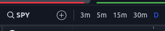
The indicator is designed to work on time frames of 5m to 1D. You will still see some lines on the 3m but many will be missing. Below 3m most lines will not load.
With continuous contracts like crypto or futures, time-frames below 15m may fail to load all levels.
It is always a good idea to start with 30m and work your way down to ensure you are not missing anything.
Price Scale
The levels will cause the chart to scale improperly as TV tries to fit them all on the screen. To fix this, ensure “Scale price chart only” is selected. To bring up this menu on desktop, right click on the price scale ( see picture ). On mobile, long click on the price scale.

Accessing the Settings
This indicator comes with many settings to help you tailor both how it works and how it looks to your specific preferences. To access the settings, hover over the indicator name in the top left of your chart and click the “Cog” icon.

Presets
There are many options for this indicator. To help get new users up and running there are several included presets.
Analysis Presets affect Analysis Length Selection, merge lines of different types, and % diff for merging.
Color Presets affect Line Style color selections.
Layout Presets affect a variety of visual settings.
Hovering over the tool-tip next to each preset selection will provide more information about which settings are being used for that configuration.


Types of Lines
By default there are 4 types of levels represented on the chart. These can be turned off and on individually in the settings. For example, if you don't want to see the POC because you are already using another volume profile indicator you could disable that type from the settings. Each type of level is defined below.
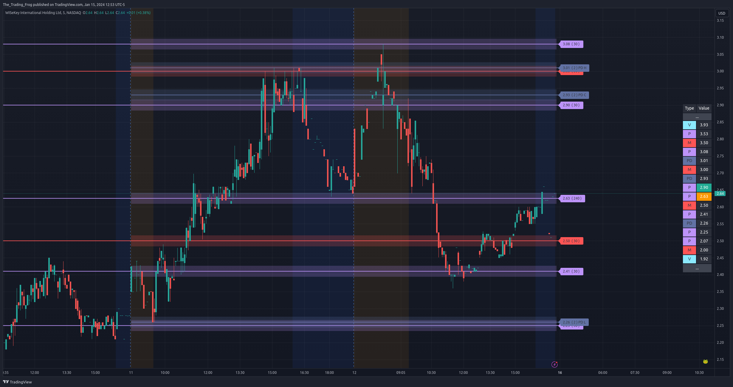
Price Derived S/R ( P ): These lines are derived from pivot points in the raw price data run through the S/R algorithm.
Volume Derived S/R ( V ): These lines are derived by using intra-day volume to identify points of control. These daily areas of increased activity are then used to identify critical levels over the requested timeframe.
Point of Control ( POC ): This range represents where the majority of intra-day volume occurred over the requested timeframe.
Developing Point of Control ( DPOC ): This level is derived from the last 1+ days of volume data in realtime and shows where the most shares have been traded..
Gap ( G ): These ranges show areas of gaps in the price action which often act as magnets. Gaps like to be closed.
Psychological ( M ): Disabled By Default. These levels are typically nice round increments that traders flock to. As such they often act as areas of support and resistance.
Previous Day ( PD ): Displays the previous days High, Low and Close on the chart and table.
Pre-Market ( PM ): Displays the pre-market High, Low and Close on the chart and table.
Analysis Lengths
These lines are generated by an external tool and then loaded into TradingView. As such the levels are based on static ranges of price data. To allow for flexibility, multiple time ranges (number of bars) are analyzed and can be toggled in the settings. A common way to leverage this is to study the chart and identify the range which captures the price movements you want to include in your SR analysi,s and then choose the length in the settings that encapsulates the range. You can enable as few or as many periods as you want.
Experiment with which timeframes are being displayed on each chart until you find the combination that seems to be most respected.
A good starting point is enabling the 30, 90, and 240 period lengths. This provides a good selection of short and long term levels.
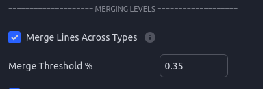
Merging Levels
When enabling many time periods you may find that the chart starts to get overwhelmed with lines that are fairly close to each other. In the settings you will find an option to Merge such lines.
Merge Across Types- will allow a “P” price line to merge with a “V” volume line. If this is disabled only lines of the same type will be merged. Currently only price and volume lines can be merged, the rest will remain distinct.
Merge Threshold % - This is how close the lines need to be expressed as a % of the current stock price. For small caps I normally set this to 3%; for large caps / indexes I normally use 0.0 - 0.3 %.

Merged Ghost Lines
When line merging is enabled, you might sometimes see the price action bounce right above or below the merged line. This is likely because the show level is an average of the merged levels. While merging helps to clean up the chart, it is important to remember that for merged lines you should pretend there is a larger box around the level. For those that want the clean chart but still want to see the original levels this option is for you. Enabling it will show faint levels where the original levels would have been. You can adjust the line style and opacity of these “Ghosts” in the settings.

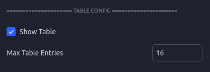
Level Table
The level table is another view of the price levels and is helpful for quickly identifying where the current price is relative to the support and resistance levels.
The closest level above the current price will be highlighted in green ( by default ) and the closest level below the current price will be highlighted in yellow ( by default ).
Gaps and POC ranges are shown using the left most column to indicate that the values are connected and represent a range.
The table can be moved around or disabled. The number of rows can be limited which is helpful if you are trying to save screen real estate.

Level Labels
Each line on the chart has an associated label which can be tweaked and disabled to fit your visual preferences. The labels contain not only the price but extra metadata.
If “Include Analysis Length” is enabled in the settings, each label will have a number inside parenthesis ex. ( 240 ). This number represents which analysis length was used to derive the level. Some stocks will tend to respect certain lengths more than others so having this on the label can help inform how much confidence you put into each specific level.
After the analysis period there is a section for sub-type. This is primarily used for the Pre-Market and Previous Day levels to let you know what specifically each level represents.
PD L - Previous Day Low
PD H - Previous Day High
PD C - Previous Day Close
PM H - Pre-Market High
PM L - Pre-Market Low
PM O - Pre-Market Open
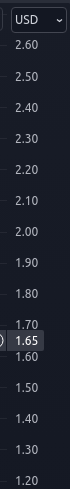
A colon in the label shows that this level was merged with another of a different type. The values after the “:” will let you know the type that was merged. In the picture look at the Volume level in blue at 1.69. The “: P” at the end shows that this level merged with a Price level.

Label Tooltips
Hovering over each label will bring up a tooltip containing additional information.
This information includes:
The Type
The Analysis Period
If the level was merged with another, it will include the type and original prices from those levels.
Ranges will show the top and bottom of the range.
Diff Current Price - How far the current price is from this level as a percentage.
Level Bands - Ranges
In the settings there is an option to enable Boxes around each level. This will draw a box, in addition to a line, around each level to help remind you that the levels represent ranges and not exact values. Although you will often see price react to the levels very precisely, each level is calculated with a certain amount of uncertainty. Showing them as a box is a helpful reminder to not trade to the exact price shown.
The box sizing is scaled for each ticker based on an average of the tickers ADR or Average Daily Range. This works well for most, but for some tickers you may find the boxes are too small or large. In this case using the “Box Size Multiplier” will allow you to fine tune the box sizing.
You can also adjust the opacity in this section of the config.
Updating The Indicator
The indicator receives frequent updates to fix bugs, optimize performance, and add new features. TradingView will send out an email each time an update is released. The indicator on your chart will not automatically update. To apply the update, remove the indicator using the X as seen in the picture, restart TV / refresh the webpage, and then add the indicator back the same as you did the first time. You will need to reconfigure your settings so take note of them before you update.
At the bottom right of your chart there is a version string. You can check that version against what is listed here on the website to ensure you are running the latest version.
CURRENT VERSION: 2.1.0